Tampieri
Tampieri
Tampieri is an important industrial group, leader in different fields, both national and international.
Time, family, passion, positivity, sustainability, ethics, territory and investments in the production improvement are the values the group wants to communicate by means of a unique graphic sign.
The challenge for the design of the new corporate identity is to keep together the multifaceted reality of the group: different production sectors, a set of values and principles, the human factor.
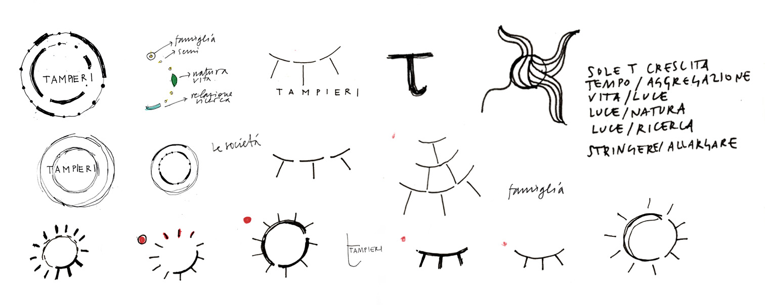
The keypoint for the new corporate identity focuses on the idea of family on three levels i.e. the family that founded the group, the family extended to collaborators and workers, and the one formed by the three different companies. Three Ts were therefore chosen to represent Tampieri.
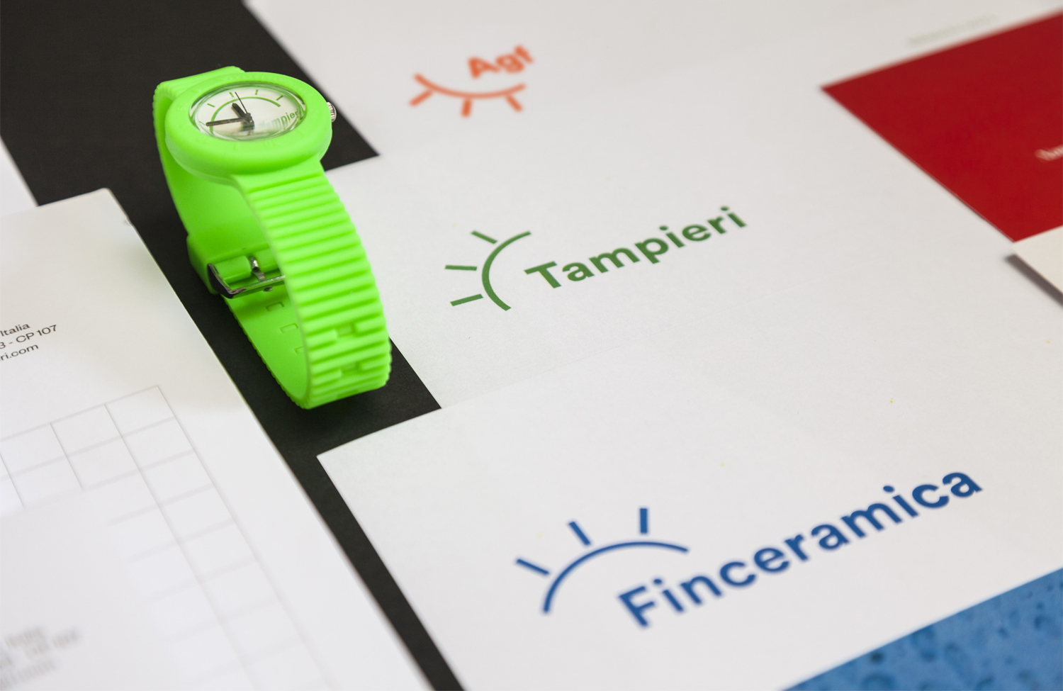
The trademark is generated by a rotational motion creating a time system: Tampieri Time, governed by the Sun, symbol of energy and vitality, essence of the spirit of the group, whereas colours identify the different business areas.
Digital communication is conceived as a macro-website gathering up the sites of the three companies, each with its identity but all related to each other by means of the visual language.
Categories visual identity | corporate image | brands | signage | web | advertising
Client Tampieri Financial Group – communication menager Vittoria Graziani
Year 2015 – 2019
Photo credits Marco Covi | Tampieri's archive


