Major
1905
Date of birth of Angelo Braghetta, the founder of the Major company, was born.
‘50 | ‘60
During the economic boom Major opens the first distributors in Veneto.
1970 | 2015
The Major logo is replaced by other international oil brands. The property remains Braghetta.
2016 | 2017
Major brand is used again. Restyling of the logo and design of the oil stations.
Major
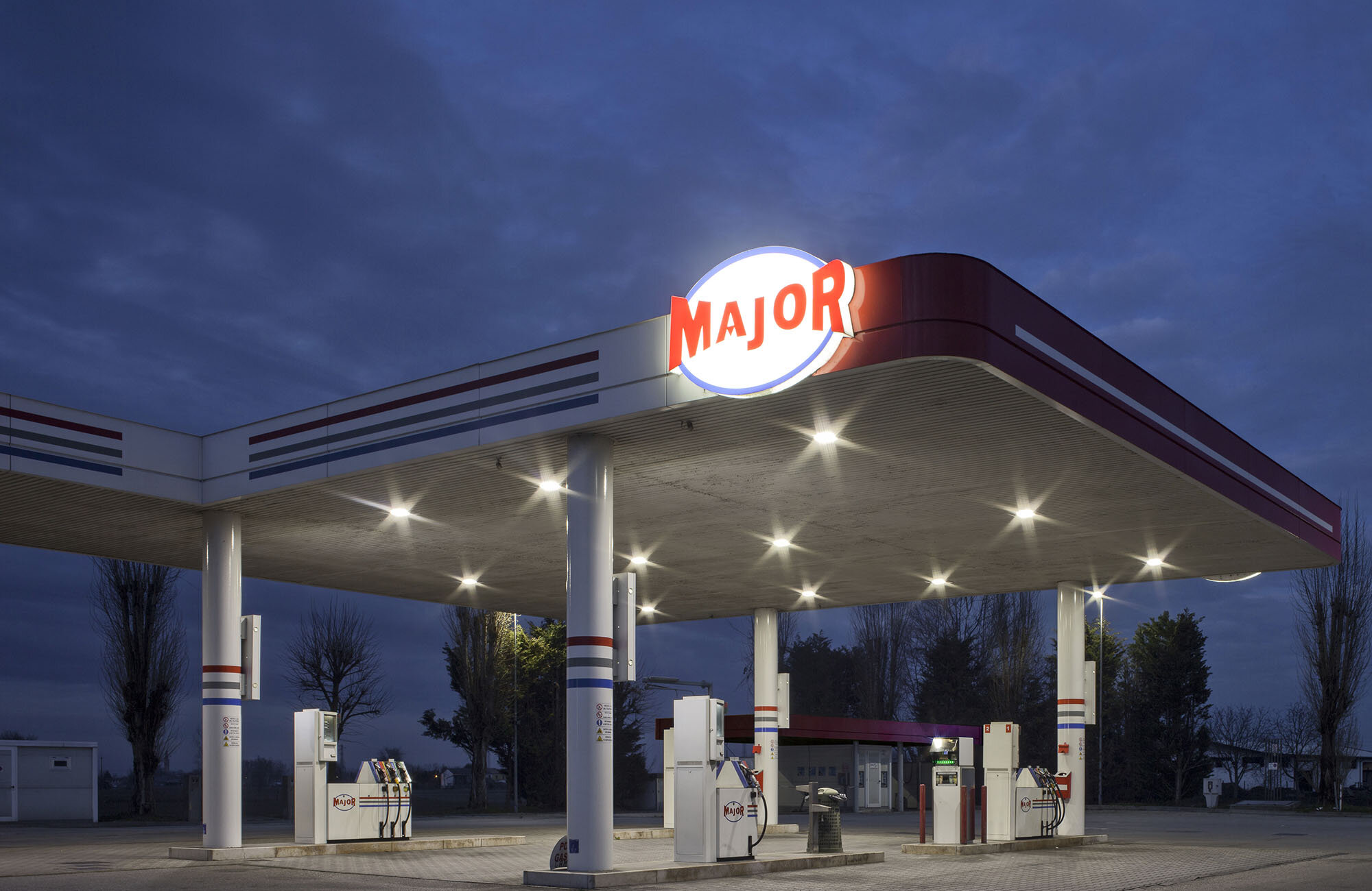
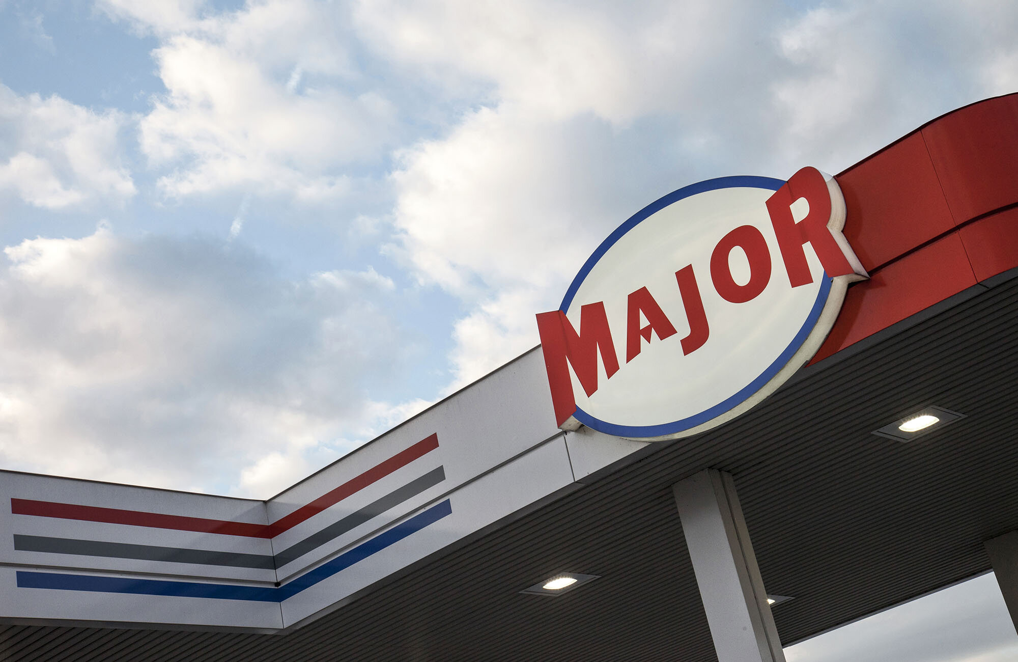
Major is a net of twenty-five gas stations spread all around Veneto. Its name is synonym of local pride in a sector dominated by major oil companies. The project for the corporate identity takes its start from the imaginary of 1950s and 1960s Italian and North-American gas stations with the many visual suggestions they imply. The stations become signs, icons with a temporal and spatial significance. They concern everyday life and the memory of the past, an idea of vicinity and regional. They both talk about the brand and are a sign of local identity.
Categories brand restyling | retail | graphic-visual identity of service stations
Client Major – Braghetta SAS
Year 2014 – 2015
Photo credits Alessandra Chemollo


