Sandalj
Sandalj
Sandalj has been producing and distributing high-quality coffee for over seventy years.
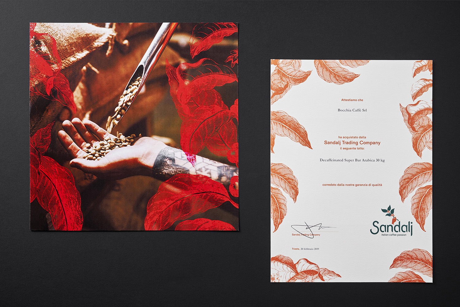
In 2017 the company decided to update its corporate identity and commissioned +fortuna its entire rebranding with the restyling of the logo, of the characteristic jute sacks and the exhibition stands. The more dynamic and contemporary communicative capacity of the logo originates from the simplification of its shape and the redesigning of lines. The result is a more incisive image, which maintains its recognizability and the complex imaginary underlying it. The imaginary - intended as both the system of signs, symbols, concepts and values and the iconographic heritage - is given a sense through a narration that organizes its elements in a coherent and meaningful set.
The aim is to emphasize the role of the company as a builder of bridges and connections between the continents by means of an anthropological approach that shapes and enhances the manifold human aspects inherent the different forms of economy.
Categories brand restyling | corporate image | retail
Client Sandalj Trading Company
Year 2017 - 2019
Photo credits Roberto Pastrovicchio


